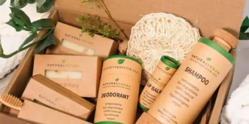
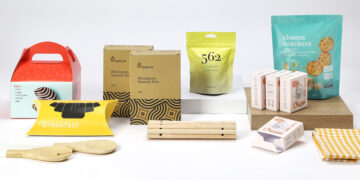
Packaging is the first impression that consumers have of your product. When you have packaging designed and manufactured correctly, it should be a point of pride for your brand. Customers should feel like they’re getting an experience with your brand rather than simply opening a box or bottle.
It’s important to note that even if the packaging on your product isn’t appealing to the eye, it can still be effective at driving sales through its price point or functional attributes (such as resealability). Even though attractive packaging might cost more upfront, it can help you reach customers who are willing to spend a little bit more money for better quality.

What to look for in a successful brand packaging campaign.
Packaging is a chance for your brand to set itself apart. Pre-packaging can be a great way to introduce your product to new customers, and get potential customers excited about your brand. Before you invest any time or money into marketing your packaging, you should make sure that it’s working.
Before you try and reinvent the wheel, you can look at other brands and what has been successful for them in branding their packaging. What has been successful for other brands when it comes to packaging? What are the trends?
Create visual hierarchy
Packaging should be designed to help customers understand the hierarchy of your product. Too many brands overdo this, and the packaging begins to look messy and disorganized. Be sure to keep your branding and colours simple while maintaining a logical visual hierarchy.
Try to create a visual hierarchy that helps customers understand the different categories or groups that your product falls into. For example, if your product is a nutrient food, you might want to create a visual hierarchy that starts with the most popular vegetables and fruits, then moves into more common vitamins, herbs, and minerals, and then ends with more unusual ones that consumers might not commonly associate with food.
Use colour contrast and brightness
Packaging materials have a huge impact on the overall look of your product. While a vibrant colour might be enticing to the eye, it can also be confusing and even off-putting to consumers.
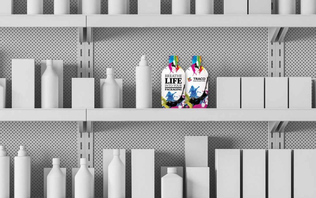
The bright side of this is that you also can tone down some of the more eccentric printing methods and keep a more professional and tasteful look. When choosing the right colour for your packaging, you should make sure that it contrasts well with both the colour of your product and the colour of the shelf underneath your product.
Don’t skimp on printing costs
Packaging isn’t just about the look and feel of your product. It’s also about getting it into the hands of new customers. You don’t want to shortchange the printing costs, while still trying to keep the overall cost of your product under control. Packaging can often be one of the most expensive parts of an entire product line.
This is especially true for higher-margin food products, but it can also be true for other products. To keep printing costs in control, you want to make sure that your packaging is easily recyclable, and is made from sustainable materials. You also want to make sure that your product is appropriately sized for the packaging that you’re using.
Incentivise the purchase
You don’t have to give away your product for free. There are many ways to incentivise the purchase of your product. An easy way to incentivise the purchase of your product is to include a gift with the purchase.
Gift-with-purchase offers are a great way to provide a little bit of extra value with your product. When you include a gift with a purchase, you create an extra hook for your customers. They might want to purchase multiple units of your product because it has appealed to them with a gift.
Be careful with your wording
The words that you use in your product packaging can have a big impact on your brand. You don’t want to over-embellish or inflate the claims that you make about your product. You also don’t want to be deceptive about your product. Importantly, you want to avoid using words in your product description that could mislead consumers.
For example, using words like “natural” or “organic” in your product description is usually a bad idea, and can mislead consumers or spark fraudulent claims. You want to use words in your product description that accurately represent your product.

Include a gift with the purchase
You don’t have to give away your product for free. There are many ways to incentivise the purchase of your product. An easy way to incentivise the purchase of your product is to include a gift with the purchase. Gift-with-purchase offers are a great way to provide a little bit of extra value with your product.
When you include a gift with a purchase, you create an extra hook for your customers. They might want to purchase multiple units of your product because it has appealed to them with a gift.
Final thoughts
Packaging is the first impression that consumers have of your product. When you have packaging designed and manufactured correctly, it should be a point of pride for your brand. Customers should feel like they’re getting an experience with your brand rather than simply opening a box or bottle.
It’s important to note that even if the packaging on your product isn’t appealing to the eye, it can still be effective at driving sales through its price point or functional attributes (such as resealability). Even though attractive packaging might cost more upfront, it can help you reach customers who are willing to spend a little bit more money for better quality.
These are just a few of the ways that you can improve the overall look of your packaging and brands. Remember to keep the issues that you face in mind, and use that as your guide when you want to re-design the look of your product.


